Image source: Getty Images
It's the most wonderful time of the (investing) year.
No, not earnings season (though that's always interesting).
No, not dividend season (though I'm looking forward to that).
No, not tax time (obviously).
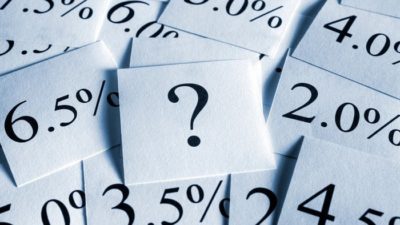
Instead, it's the time of year when fund manager, Vanguard, releases its updated Index Chart, showing the return of various asset classes over the previous thirty years.
Yes, Happy Vanguard Index Chart Day, to all who celebrate!
Now, it's true that I'm an investing nerd. So the things that excite me might not always excite you. That's my cross to bear.
But I hope this isn't one of those times.
See, in my humble opinion the Vanguard Index Chart is the single most powerful image in investing.
And in a coincidence of timing, it was released yesterday, the same day as AMP Ltd (ASX: AMP) released some research showing that 'more than half of Australians under 40 don't understand the concept of compounding'.
Now, I hope that if you're reading this, you're not one of those people.
But I don't want to assume.
And, even if you do understand compounding, nothing quite brings it home like looking at the latest Vanguard Index Chart.
Also, if you do get it, please, please do me a favour and share this article – or at least the chart itself – with friends and family who could benefit.
(A little… strange, but true: I have a copy of the 2022 Index Chart on my wall at home. It has started conversations with family, friends and tradies. It really, really works No, I'm not suggesting you do that – though I'm not saying you shouldn't – but please do your loved ones a favour and at least send them a digital copy.)
Anyway, back to the chart. Here it is:

And what does it tell us?
That a hypothetical $10,000 invested in the ASX in 1995 would have compounded by 9.3% per year since then, to be worth $143,786 thirty years later.
That is, you would have been $133,786 richer without lifting a finger!
I hope that blows your mind, even if you've heard similar things before.
And by the way, that's without a single extra dollar saved and invested!
That… that… is compounding.
For some people, 9.3% annual returns don't sound like much, and fair enough.
"You mean, I put $1,000 away and at the end of the year, I've only made $93? That's better than nothing, but hardly worth it." might be the instinctive reaction.
And fair enough, in the first year.
If they don't understand compounding, that's where most people get bored and wander away from the passionate finance guy in the corner (or so I'm told).
Even 30 years of 9.3% doesn't exactly sound exciting. 30 times 9.3% is 279%, and that's better than a kick in the teeth, but a long time to wait for a 300% return.
Except, as I'm sure you know, that's now how compounding works.
It's not 30 x 9.3%. It's 9.3% on an ever increasing base (no, it won't grow every year, but that's the average).
You're walking up a(n imperfect) staircase. Each step from an ever (on average) higher base.
Yes, a lot of brackets there. Because the journey won't be smooth.
But again, that's also what the Vanguard chart shows.
You can see the dot.com crash. The GFC. The COVID crash.
It doesn't pretend every day, week, month or year has been either rosy or easy.
But what it shows is that the journey is well and truly worth it.
By a factor of about 14 times, if you don't mind!
So, when you feel like you're not getting anywhere, take another look at the chart.
When your shares have fallen, take another look at the chart.
When you wonder whether to invest, or why you bother investing, take another look at the chart.
When the economic future feels bleak, take another look at the chart.
When your least favourite party or president is in power, take another look at the chart.
When someone tells you that 'this time it's different', take another look at the chart.
And when you try to make a quick buck, rather than letting slow and steady win the race… yes, take a look at the chart.
I can't tell you what the future will look like. I'm not allowed to make those promises (and anyway, I don't do predictions).
But the thought I want to leave you with, as you take that chart with you, is that the ~9% return over that 30 year period is pretty close to the long term annual gain over more than a century, too, according to Credit Suisse.
And, unless democratic capitalism has peaked, innovation is dead and incentives no longer incentivise, my strong suspicion is that the future will be bright.
There will be very good years. And some rough ones. There will be good news and bad. Scary headlines will proliferate and fears will come and go.
Thing is, I would have said that in 1995, as well.
Maybe that's the key lesson from the chart.
Happy Vanguard Index Chart Day!
Fool on!