Australians have been inundated with new rules and restrictions in relation to the coronavirus crisis. Some of these regulations, we're being warned, could last for 6 months, or perhaps longer, to help stem the rate of growth in coronavirus cases around the country.
In the chart below, the blue line represents the total number of reported cases in Australia (measured on the left axis). On 22 February there were 19 cases; we surpassed 100 cases on 11 March, eclipsed 1,000 cases on 21 March, and had 5,687 cases yesterday, on 5 April.
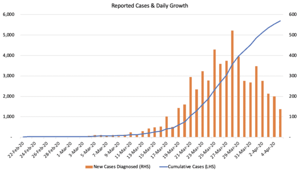
That represents a compounded daily growth rate of 14.2% over 43 days. If we continued at that pace for another 43 days, we'd have 1,702,209 cases by 18 May.
What's more, using the World Health Organization (WHO)'s estimated fatality rate of 3.4%, more than 57,800 people would have succumbed to COVID-19, the disease caused by the coronavirus.
As is clear from the chart above, however, the rate of growth has dropped off, substantially.
In fact, at one point only a few weeks ago the coronavirus case numbers were rising more than 25% daily, compared to low single-digit growth today. Does this mean that the restrictions put in place are working?
How effective are these restrictions?
This is, in large part, the result of government intervention, which has resulted in the unprecedented restrictions we are currently facing.
Below is a timeline of when those restrictions were put in place (notably, this is not an exhaustive timetable — many other restrictions, including state-specific restrictions, have also been put in place).
The chart also differentiates between new confirmed cases and new infections, assuming an incubation period of 6 days (which is the incubation period for the median case).
As an example, while the Federal Government's Stage 2 restrictions came into force on 24 March 2020, we would assume that would have an immediate impact on new infections, but those new cases would not be confirmed by testing until 6 days later.
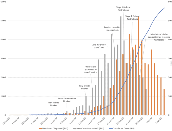
This chart is by no means perfect. While I have assumed an incubation period of 6 days (again, this is considered the median incubation period), the incubation period for coronavirus cases is currently estimated between 2 and 14 days.
But I think it does give a pretty good indication of the effectiveness of the restrictions themselves.
Blocking arrivals from Iran, South Korea, and Italy, for instance, likely went some way towards reducing imported coronavirus cases from certain 'coronavirus hotspots' around the world, but others were still being imported undetected from countries like the United States.
The Stage 1 and Stage 2 restrictions enforced by the Federal Government, on the other hand, appear to have had a much more significant impact. These involved strict social distancing rules, and the closure of various venues such as gyms.
Coronavirus cases by state
The bulk of Australia's coronavirus cases are located in New South Wales. Its overall share of Australia's coronavirus cases has remained steady at approximately 45% between 16 March 2020 and 5 April 2020, growing from 134 cases to 2,580 cases in that time.
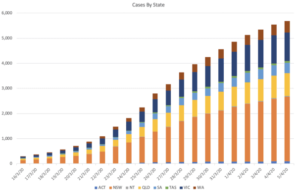
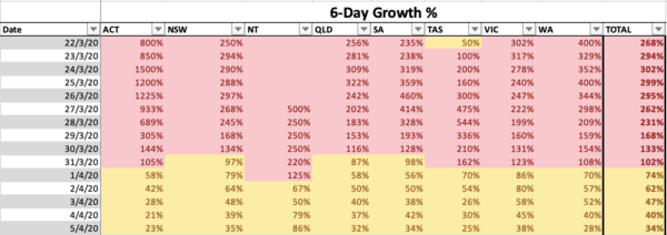
Pleasingly, however, each of Australia's states and territories are now taking more than 6 days to double their cases. The big outlier is Northern Territory, which is experiencing case growth of 86% every 6 days, although that is off a much smaller base (it had just 26 recorded cases on Sunday 5 April, compared to 14 cases 6 days earlier). Victoria is experiencing the next highest rate of 6-day growth at 38%, followed by New South Wales at 35%.
The rate of daily growth, on the other hand, has slowed to low single digits. While that does not welcome complacency (more on that in a moment), it is a very pleasing statistic.
Testing for coronavirus
When we talk about the number of coronavirus cases, one thing that is often overlooked is the number of tests being conducted. Without testing, a country could, theoretically, claim to have no official coronavirus cases.
Likewise, without testing the entire population regularly, there is no way of knowing exactly how many actual coronavirus cases there are. Hence, it is likely there are many, many more individuals who have coronavirus and are showing only very mild symptoms, or perhaps none at all, who are not included in the country's official coronavirus cases.
In many ways, it is those individuals who we need to be most careful to avoid. Ironically, they are the ones who are more difficult to detect, hence the importance of the government's strict social distancing rules (that way, we avoid becoming infected from people who may not even know they are infected).
According to the Federal Government, 297,000 tests had been conducted by 5 April. That represents a testing rate of approximately 11.6 tests per 1,000 people in Australia, with 1 in 52 of those resulting in a 'positive' result.
That is a high rate of testing by international standards. According to Worldometers, the testing rate in Italy and Germany is roughly 10.9 tests per 1,000 people, while the United States has tested approximately 4.9 per 1,000 people.
As at 5 April 2020, more than 56,000 tests had been conducted in Victoria, and 121,443 tests had been conducted in New South Wales.
On a per capita basis, South Australia and New South Wales appear to be doing the most testing (19.8 tests per 1,000 people, 16.6 tests per 1,000 people respectively).
Based on testing figures from the Federal Government, Victoria, Tasmania and Western Australia have conducted less than 10 tests per 1,000 population.
However…
It is also important to note that Australia's rate of testing has not been scaled up. In 3 of the past 4 days, between 6,000 and 7,000 tests have been conducted each day, compared to more than 10,000 daily tests which were being conducted each day late in March.
Hence, the lower number of cases being detected each day recently may also be a function of lower testing.
Again, this suggests that the number of Australian coronavirus cases is likely much higher than the official number suggests.
No reason to become complacent
Indeed, there are many reasons to be positive about the declining growth in coronavirus cases, and also about Australia's low fatality rate (currently 0.6%).
But these positive outcomes have also raised certain doubts from some corners of the community. Namely, some people wonder: 1) whether the restrictions enforced by the federal and state governments were an overreaction; and 2) whether things will go back to 'normal' in the next few weeks.
In my opinion, the answer to both those questions is 'No'.
To the first question, here's an analogy. If you outlay for house insurance and, after 20 years, your house hasn't burned down, was buying the insurance an overreaction?
Without these restrictions, the rate of growth would very likely have been much higher than what we are experiencing now. In a recent interview, Prime Minister Scott Morrison said that without these measures, a further 5,000 Australians would have been infected with coronavirus.
By my numbers (based on the growth in cases that Australia was experiencing), I would suggest that number would have been closer to an additional 10,000.
At that stage, our hospitals would more than likely have already become overwhelmed, and our fatality rate would likely have been much higher (due to many individuals not receiving the level of care required).
To the second question, growth in coronavirus cases is slowing. But as I alluded to above, there are likely still many cases that have gone undetected in the community.
The chart below, from the Australian Government, shows the source of COVID-19 transmission by state and territory. The light blue bars and the grey bars, which appear to add to around 600–700 cases in aggregate, are either under investigation or locally acquired from an unknown source.
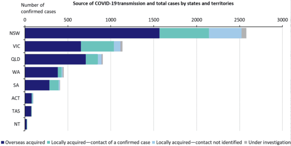
Indeed, overseas acquired cases represented the bulk of Australia's new cases in the early days of the coronavirus outbreak. Now that that source of infection has slowed dramatically (due to travel bans), new cases appear to be mostly from within the community.
Hence, local transmission still represents a large threat, and could result in an increase in cases growth if individuals begin to become complacent.
The chart below shows a hypothetical scenario whereby all restrictions were removed today. It assumes a 3% rate of new case growth for 5 days, with growth then gradually increasing to 20% per day in 15 days.
Given the rates of growth experienced in recent weeks in Australia, and the rates of growth experienced internationally, that does not seem like an unreasonable expectation.
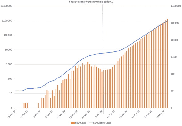
The chart is shown on a logarithmic scale. Again, assuming all restrictions were relaxed, we could theoretically be adding more than 100,000 cases per day by 12 May.
Hence, relaxing the restrictions too soon, or too abruptly, is by no means in our best interests.
How is the share market holding up?
The S&P/ASX 200 Index (ASX: XJO) soared last week, and has continued to recover ground this morning. At time of writing, the market has risen 127 points or 2.5% to 5,194 points. The Commonwealth Bank of Australia (ASX: CBA) share price is up 2.6%.
Personally, I feel the best way for investors to approach this market is with caution. Volatility levels have certainly declined, but that doesn't mean there won't be more bad news, and that can certainly impact share prices.
Hence, perhaps the best way to buy into shares is by taking small nibbles, particularly in businesses you feel are well equipped to handle the current crisis. Strong balance sheets are a must in this climate, while those businesses that are able to continue operating mostly through remote work are ideal.
For instance, many cloud-based businesses such as Elmo Software Ltd (ASX: ELO) and Bigtincan Holdings Ltd (ASX: BTH) have both adapted to remote work.
On the other hand, companies such as Flight Centre Travel Group Ltd (ASX: FLT) have been forced to make massive cost reductions and participate in heavily dilutive equity raises. With a highly uncertain outlook in the travel sector, I'm certainly not investing in that space right now.
Foolish bottom line
A picture is worth a thousand words and whilst the charts above demonstrate that we are making progress in the fight against COVID-19, the battle is not yet over. Scott Morrison has suggested that we get used to the idea of these heavy restrictions for 6 months. Despite the pleasing progress that has been made, you shouldn't expect those restrictions to be lifted any time soon.
This should also influence your investing perspective. Look for businesses that are equipped to weather the storm, and those that can continue operating under the tough social distancing rules (e.g. those with many workers who can work remotely).